
GridLayout is one of Kivy’s layouts that arranges widgets in a grid, which, like BoxLayout, is automatically aligned by Kivy. This article describes how to use GridLayout, how to set the widget alignment direction and how to enforce widget size.
How to Use GridLayout
GridLayout is a layout where you set the rows and columns and place the widgets in a grid, which is automatically aligned by Kivy just like BoxLayout. Cells cannot be merged.
Setting the Number of Columns and Rows
The cols specifies the number of columns and rows specifies the number of rows. This statement cannot be omitted.
<RootWidget>:
    cols: 2
    rows: 2
Normally, defining either cols or rows is sufficient. If you do not write this description, the widgets will be overlapped at the bottom left of the screen.
Setting the Direction in Which Widgets are Arranged
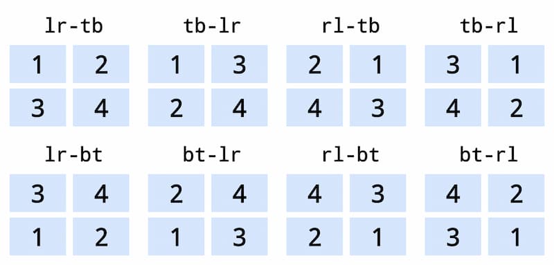
To set the widget orientation, specify [ lr-tb, tb-lr, rl-tb, tb-rl , lr-bt, bt-lr, rl-bt, bt-rl ] in the orientation property. The default is lr-tb. l” means left, “r” means right, “t” means top, and “b” means bottom.
- lr-tb: Left to Right – Top to Bottom (default)
- tb-lr: Top to Bottom – Left to Right
- rl-tb: Right to Left – Top to Bottom
- tb-rl: Top to Bottom – Right to Left
- lr-bt: Left to Right – Bottom to Top
- bt-lr: Bottom to Top – Left to Right
- rl-bt: Right to Left – Bottom to Top
- bt-rl: Bottom to Top – Right to Left
<RootWidget>:
    orientation: 'lr-tb'
Setting the Inner Margins of a Layout and the Space between Widgets
To set the inner margins of a layout, define padding.
<RootWidget>:
    padding: 20
To set the space between widgets, define spacing.
<RootWidget>:
    spacing: 10
Please refer to the following article for more information on padding and spacing.

Setting the Widget Size
To set the widget size, define the size_hint or size property. Note that unlike other layouts, GridLayout requires the same setting for all widgets in a row or column to take effect. For example, to change the widget size of the first row, define size_hint or size on widgets 1 through 5. To change the widget size of the first column, define size_hint or size on widgets 1, 6, and 11.
| 1 | 2 | 3 | 4 | 5 |
| 6 | 7 | 8 | 9 | 10 |
| 11 | 12 | 13 | 14 | 15 |
The size_hint or size property is explained in the following article.
Another way to resize a widget is to force the widget size, which is described next.
Force Widget Size
You can use * _force_default or *_default_height together to force the widget size. When this is used, size_hint and size are disabled even if they are defined.
Enforcing Cell Size
You can use col_force_default or col_default_width to force row or column cells to the default size. Specify whether to force with True or False. Default is False.
- col_force_default: force row cells to default size.
- row_force_default: force column cells to default size.
This must be used with row_default_height or col_default_width, described next, to be effective.
Changing Row and Column Default Values
Changing the default values for rows and columns resizes the cells. As a result, the widget size will change to match the cell size. Because *_force_default prevents the use of size_hint, etc., the widget size will default. The default is 1, which matches the cell size, which in turn changes the widget size.
To change the default values for rows and columns, define row_default_height or col_default_width. The default value is 0.
- col_default_width: change the default value of a cell in a column.
- row_default_height: change the default value of a cell in a row.
<RootWidget>:
row_force_default: True
col_force_default: True
row_default_height: 100
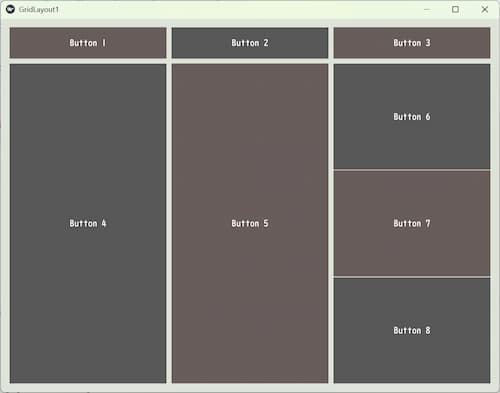
col_default_width: 380GridLayout Code Example
This is an example code that shows how to describe the GridLayout properties described in this article. Feel free to change the settings and experiment.
gridlayout1.py
from kivy.app import App
from kivy.uix.gridlayout import GridLayout

class RootWidget(GridLayout):
    pass

class GridLayout1(App):
    def build(self):
        return RootWidget()

if __name__ == "__main__":
    GridLayout1().run()
gridlayout1.kv
<RootWidget>:
    canvas.before:
        Color:
            rgba: 222/255, 228/255, 215/255, 1
        Rectangle:
            size: self.size
            pos: self.pos

    #cols: 2
    rows: 2

    orientation: 'lr-tb' # Left to Right - Top to Bottom (default)
    #orientation: 'tb-lr' # Top to Bottom - Left to Right
    #orientation: 'rl-tb' # Right to Left - Top to Bottom
    #orientation: 'tb-rl' # Top to Bottom - Right to Left
    #orientation: 'lr-bt' # Left to Right - Bottom to Top
    #orientation: 'bt-lr' # Bottom to Top - Left to Right
    #orientation: 'rl-bt' # Right to Left - Bottom to Top
    #orientation: 'bt-rl' # Bottom to Top - Right to Left

    spacing: 10
    padding: 20

    #row_force_default: True
    #col_force_default: True

    #row_default_height: 100
    #col_default_width: 200


    Button:
        text: 'Button 1'
        background_color: 153/255, 102/255, 111/255, 0.7
        size_hint: 0.3, 0.1
    Button:
        text: 'Button 2'
        size_hint: 0.3, 0.1
    Button:
        text: 'Button 3'
        background_color: 153/255, 102/255, 111/255, 0.7
        size_hint: 0.3, 0.1
    Button:
        text: 'Button 4'
    Button:
        text: 'Button 5'
        background_color: 153/255, 102/255, 111/255, 0.7

    GridLayout:
        rows:3
        Button:
            text: 'Button 6'
        Button:
            text: 'Button 7'
            background_color: 153/255, 102/255, 111/255, 0.7
        Button:
            text: 'Button 8'
Setting the background color is explained in the following article.
Comment