These are examples of code for dragging and moving labels, images, and other widgets in Kivy. These code examples are written primarily in the kv language. There are several ways to perform dragging, but here we use the DragBehavior class of the Behavior module, a mixin feature of Kivy, and ScatterLayout to achieve the dragging behavior.
How to Drag Widgets
Kivy Behavior module provides several mixin classes that combine some kind of behavior with basic widgets such as buttons and labels. therein, the DragBehavior class provides the ability to drag widgets.
How to Drag a Button
The sample code introduced here is a rewritten version of the sample introduced on the official Kivy website in the kv language.
example_behavior1.py
from kivy.app import App
from kivy.uix.floatlayout import FloatLayout

class RootWidget(FloatLayout):
    pass

class ExampleBehavior1(App):
    def build(self):
        return RootWidget()

if __name__ == "__main__":
    ExampleBehavior1().run()
examplebehavior1.kv
<DraggableButton@DragBehavior+Button>
    font_size: 30
    drag_rectangle: self.x, self.y, self.width, self.height
    drag_timeout: 100000000
    drag_distance: 0

<RootWidget>:
    DraggableButton:
        text: 'It can be dragged.'
        size_hint: 0.2, 0.2
        center_x: 500
        center_y: 500
Code Explanation
This code is written using multiple inheritance of dynamic class rules in the kv language. Please refer to the following article on how to write dynamic class rules.
When using the DragBehavior class to drag, the following process is described.
- Set the area that can be dragged.
- Set the drag timeout period.
- Set the drag distance.
from kivy.uix.floatlayout import FloatLayout

class RootWidget(FloatLayout): Set the float layout to
    pass
The FloatLayout is better suited for this type of layout than BoxLayout, because FloatLayout allows widgets to be placed anywhere, while BoxLayout does not allow you to use pos and pos_hint to set the position of widgets. A layout similar to FloatLayout is ScatterLayout.
<DraggableButton@DragBehavior+Button>This is a multiple inheritance of the DragBehavior and Button classes; DragBehavior must be written first.
drag_rectangle: self.x, self.y, self.width, self.heightThe drag_rectangle sets the drag timeout. Setting a large value here will prevent the drag from being canceled; 0.1 seconds is 100 and 1 second is 1000.
drag_timeout: 100000000The drag_timeout sets the drag timeout. A large value ensures that the drag will not be canceled; 0.1 second is 100 and 1 second is 1000.
drag_distance: 0The drag_distance sets the minimum distance that must be traveled to initiate a drag. 0 makes the widget immediately ready for dragging.
You can still drag a widget with these settings. However, since the draggable area is set to the screen size, you can click and drag anywhere on the screen. This means that it is preferable to be able to click only on the area around the widget. For example, if there is only one widget, this may not seem like a problem, but if there are multiple widgets, the clickable areas will overlap and the widget will be dragged at the same time.
To solve this, use size_hint to adjust the widget size. I tried to get the texture area (drawing area) of the widget and set it to the draggable area, but this did not work, so I am presenting this method. There may be a better way.
For more information on size_hint, please see the following article.
DraggableButton:.A custom widget defined in a dynamic class rules is placed in the tree.
size_hint: 0.2, 0.2Sets the size of the widget.
center_x: 500
center_y: 500
Sets the initial position of the widget, using pos, pos_hint, and other position-setting properties to determine where it will be placed.
pos_hint: {'center_x': 0.5, 'center_y': 0.5}Note that if you fix the position with [center,center] as shown above, you will not be able to drag the image.
Dragging Images
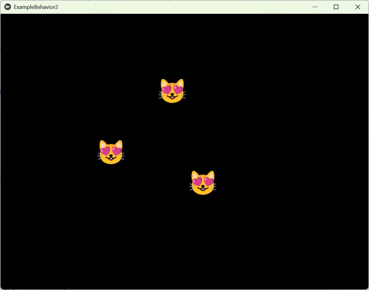
The DragBehavior class can also drag an image. The method is the same as in the previous section. In this example, multiple images are placed and the drag area is adjusted with size_hint so that they do not overlap.
examplebehavior2.kv
The py file is the same as the first code.
<DraggableIcon@DragBehavior+Image>
    source: 'icon.png'
    size: self.texture_size
    drag_rectangle: self.x, self.y, self.width, self.height
    drag_timeout: 100000000
    drag_distance: 0

<RootWidget>:
    DraggableIcon:
        pos: 600, 300
        size_hint: 0.1, 0.1
    DraggableIcon:
        pos: 500, 600
        size_hint: 0.1, 0.1
    DraggableIcon:
        pos: 300, 400
        size_hint: 0.1, 0.1
Code Explanation
<DraggableIcon@DragBehavior+Image>Here, the DragBehavior class and the Image widget are inherited multiply; the DragBehavior class must be written first.
source: 'icon.png'To display an image, specify the path to the image in the source property. In this case, the image file is placed where the script file is placed. If you are creating a mobile app, it is recommended to specify the absolute path.
size: self.texture_sizeSpecifies the size of the image. If you write it like this, it will be the original image size.
pos: 600, 300The pos property specifies the position of the first image to be displayed, in x (horizontal) and y (vertical) coordinates.
size_hint: 0.1, 0.1The size of the image is specified by size_hint as a percentage of the parent widget. The size of the image drag area is adjusted here.
How to Drag Labels 1
To drag a label, simply inherit from Label.
<DraggableButton@DragBehavior+Label>How to Drag Labels 2
Here is another way to drag Label to control vertical or horizontal movement. This sample is taken from the Stack Overflow site.
This sample code uses the ScatterLayout functionality for dragging. Although there are some restrictions on the widgets that can be used, it is not necessary to use the DragBehavior class, and drag can be implemented without using multiple inheritance of widgets, so it is recommended to use it according to your purpose.
example_behavior3.py
from kivy.app import App
from kivy.uix.floatlayout import FloatLayout

class RootWidget(FloatLayout):
    pass

class ExampleBehavior3(App):
    def build(self):
        return RootWidget()

if __name__ == '__main__':
    ExampleBehavior3().run()
examplebehavior3.kv
<RootWidget>
    Label:
        text: "Label can be moved."
    ScatterLayout:
        size_hint: 1.0, 0.2
        do_translation_x: False
        Label:
            text: 'Drag up and down'
            canvas.before:
                Color:
                    rgb: .6, .6, .6
                Rectangle:
                    pos: self.pos
                    size: self.size
Code Explanation
from kivy.uix.floatlayout import FloatLayout

class RootWidget(FloatLayout):
The FloatLayout and ScatterLayout are nested, but it is also possible to have only ScatterLayout. In this case, there are two labels, one that displays strings and one that can be dragged, and the layout is nested so that the label that displays strings cannot be dragged.
   Label: "Label is a string that can be dragged.
        text: "Label can be moved.
This Label is placed directly below the FloatLayout so that it cannot be dragged.
   ScatterLayout:.
        size_hint: 1.0, 0.2
        do_translation_x: False
The ScatterLayout is a layout that allows widgets to be placed in any position. It is similar to FloatLayout, but provides methods to move, rotate, and resize widgets.
size_hint: 1.0, 0.2The size of the label is specified here.
do_translation_x: FalseThe do_translation_x sets whether horizontal translation is allowed. do_translation_y controls vertical translation. The default is True to allow translation. In this case, horizontal translation is not allowed, so you can only drag vertically.
           canvas.before: Color: Color
                Color: rgb: .6, .6, .6, .6, .6, .6
                    rgb: .6, .6, .6
                Rectangle: self.pos
                    pos: self.pos
                    size: self.size
This sets the background color for the Label, which does not have a background_color like the Button, so the canvas is used to apply the color. See the following article for details.


Comment