This section describes how to display a pop-up window in Kivy. There are several ways to display a pop-up window, but here is some code written in the Dynamic class rules of the kv language.
Structure of a Popup
Kivy’s popups are not displayed in a separate window, but rather are pseudo-screens in the same window.
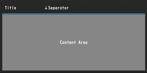
The structure of a popup is divided into several parts as shown below.

- Popup window: The black area is the popup window.
- Title: The part with the text string at the top.
- Separator: The light blue line.
- Content area: The area where widgets to be displayed in the popup window are placed.
Configuring a Popup
There are several ways to create popups, but here I will explain how to write popups using dynamic class rules in the kv language, which is the easiest to write and read. for more information about dynamic class rules in the kv language, see the following article.
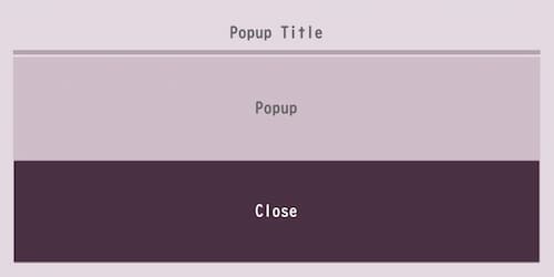
Below is a sample of a commonly used pop-up setup.

popup1.py
from kivy.app import App
from kivy.uix.boxlayout import BoxLayout

class RootWidget(BoxLayout):
    pass

class Popup1(App):
    def build(self):
        return RootWidget()

if __name__ == '__main__':
    Popup1().run()
popup1.kv
#:import Factory kivy.factory.Factory

<CustomPopup@Popup>:
    # Popup settings
    title: 'Popup Title'
    title_align: 'center'
    title_color: 100/255, 100/255, 100/255, 1
    #title_font: './font_file.ttf'
    title_size: sp(15)

    separator_color: 180/255, 164/255, 176/255, 1
    separator_height: dp(4)

    auto_dismiss: False

    size_hint: 0.6, 0.4
    background: ''
    background_color: 228/255, 216/255, 225/255, 1

    #  Content Area Settings
    BoxLayout:
        orientation: 'vertical'
        canvas.before:
            Color:
                rgba: 207/255, 190/255, 202/255, 1
            Rectangle:
                size: self.size
                pos: self.pos

        Label:
            text: 'Pop-up'
            color: 100/255, 100/255, 100/255, 1

        Button:
            text: 'Close'
            background_color: 215/255, 145/255, 197/255, 1
            on_release: root.dismiss()

<RootWidget>:
    Button:
        text: 'Open Popup'
        on_release: Factory.CustomPopup().open()
Code Explanation
In the kv file, write popup window settings, then content settings, in that order.
Import Factory to instantiate a dynamic class rules.
#:import < Alias Name > < Module name >#:import Factory kivy.factory.Import can also be done with kv files.’ #’ is not a comment. ‘ Factory’ part is an alias and can be any name.
<CustomPopup@Popup>:Define a dynamic class rules that extends the Popup class, and define the properties of the Popup class in the next line.
Setting the Title
The following is a title-related setting.
    title: 'Popup Title'
    title_align: 'center'
    title_color: 100/255, 100/255, 100/255, 1
    #title_font: './font_file.ttf'
    title_size: sp(15)
title: 'Popup Title'The title sets the title characters. Default is [No title].
title_align: 'center'The title_align sets the horizontal position. The property value can be one of [left,center,right,justify]. The default is left. justufy is the line alignment when multiple lines are used.
title_color: 100/255, 100/255, 100/255, 1The title_color sets the text color of the title. The default is [1, 1, 1, 1] and can also be specified in hexadecimal. For more information on setting the color, please refer to the following article.
title_font: './font_file.ttf'The title_font specifies the font file for the title. It is recommended that absolute paths be used.
title_size: sp(15)The title_size sets the font size of the title. The default is 14sp. The above is written in a way to convert to other units.
Set the Separator
The following are separator-related settings.
separator_color: 180/255, 164/255, 176/255, 1
separator_height: dp(4)
separator_color: 180/255, 164/255, 176/255, 1The separator_color sets the color of the separator line. Defaults to [47 / 255, 167 / 255, 212 / 255, 1].
separator_height: dp(4)The separator_height sets the height of the separator. The default is 2dp.
Sets the behavior when the user clicks outside of the popup
auto_dismiss: FalseThe auto_dismiss sets whether the popup window will close if clicked outside the popup window area. The default is True; False does not do this and requires the implementation of a button.
Setting the size of the popup
Kivy does not have a property to set the size of the popup, so use size_hint.
size_hint: 0.6, 0.4For more information on size_hint, please refer to the following article.
Setting the Background Color of a Popup Window
There is no property to set the background color of a popup window, so use background_color.
background: ''
background_color: 228/255, 216/255, 225/255, 1
The important thing here is to clear the default background information once: specify an empty string for background, and set the background color with background_color on the next line.
Set the Content Area
This area defines the layout for the root widget and places the widget as a tree, similar to the description of class rules.
   BoxLayout:
        orientation: 'vertical
        canvas.before: 'vertical'
            Color: rgba: 207/257
                rgba: 207/255, 190/255, 202/255, 1
            Rectangle: self.size
                size: self.size
                pos: self.pos

        Label: text
            text: "It's a popup"
            color: 100/255, 100/255, 100/255, 1
If you want to set the background color of the Content area, use canvas, the same as setting the layout background color. See the following article for layout background colors.
Implementing a Popup Close Button
Kivy popup does not have a event function for buttons, so you will need to create your own function. dismiss() method can only be used to close a button.
        Button:
            text: 'Close'
            background_color: 215/255, 145/255, 197/255, 1
            on_release: root.dismiss()
on_release: root.dismiss()Call dismiss() using the on_release() or on_press().
Executing a Popup Window
To execute a popup window, call the open() method on any widget using the on_release() or on_press().
<RootWidget>:
    Button:
        text: "Open popup"
        on_release: Factory.CustomPopup().open()
The namespace Factory is the alias name defined in the import statement, followed by CustomPopup(), which is the subclass name described in the dynamic class rules definition.
Implementing OK and Cancel Buttons in Popup
Here is a example code to implement the processing of the buttons. It was difficult for me because I stuck to dynamic class rules. It was a good learning experience for me. Since I went to the trouble of writing the code, I also wrote the Factory in a py file.
popup2.py
from kivy.app import App
from kivy.uix.boxlayout import BoxLayout
from kivy.factory import Factory

class RootWidget(BoxLayout):
    popup_instance = None  # Variables that manage popup instances

    def open_popup(self):
        # Open popup
        self.popup_instance = Factory.CustomPopup()
        self.popup_instance.open()

    def on_ok(self):
        self.ids.label.text = 'OK pressed.'
        self.dismiss_popup()  # Close popup

    def on_cancel(self):
        self.ids.label.text = 'Cancel pressed.'
        self.dismiss_popup()  # Close popup

    def dismiss_popup(self):
        # Close only if popup is open
        if self.popup_instance:
            self.popup_instance.dismiss()
            self.popup_instance = None

class Popup2(App):
    def build(self):
        return RootWidget()

if __name__ == '__main__':
    Popup2().run()
popup2.kv
<CustomPopup@Popup>:
    # Popup settings
    title: 'Popup Title'
    title_align: 'center'
    title_color: 100/255, 100/255, 100/255, 1
    #title_font: './font_file.ttf'
    title_size: sp(15)

    separator_color: 180/255, 164/255, 176/255, 1
    separator_height: dp(4)

    auto_dismiss: False

    size_hint: 0.6, 0.4
    background: ''
    background_color: 228/255, 216/255, 225/255, 1

    # Content Area Settings
    BoxLayout:
        orientation: 'vertical'
        canvas.before:
            Color:
                rgba: 207/255, 190/255, 202/255, 1
            Rectangle:
                size: self.size
                pos: self.pos
        Label:
            text: 'Popup!'
            color: 100/255, 100/255, 100/255, 1
        BoxLayout:
            padding: 30, 30
            spacing: 10
            Button:
                text: 'OK'
                on_press: app.root.on_ok()
            Button:
                text: 'Cancel'
                on_press: app.root.on_cancel()

<RootWidget>:
    Label:
        id: label
        text: 'You can see the popup here.'
        font_size: 30
    Button:
        text: 'Open Popup'
        font_size: 30
        on_release: root.open_popup()
Code Explanation
Below are the functions defined in the Python code.
open_popup()    # Register to Factory and execute popup.
on_ok()         # It is called when the "OK" button is pressed.
on_cancel()     # called when the "cancel" button is pressed.
dismiss_popup() # Function called when popup is closed.
Normally, a popup can be closed by calling dismiss(), but since functions registered with the Factory() are separated from other functions here, the popup instance cannot be referenced due to the scope. For example, closing a popup with on_ok() requires a popup instance, but since an instance is created with open_popup(), it cannot be referenced, so a class variable that references the popup instance is defined. Therefore, create dismiss_popup() and call dismiss_popup() with on_ok() or on_cancel() to close the popup.
Python Code
popup_instance = NoneDefined to reference popup instances from other functions. The initial value is None.
   def open_popup(self).
        # Open a popup
        self.popup_instance = Factory.CustomPopup()
        self.popup_instance.open()
The open_popup() registers the popup with Factory() and executes it. Since the dynamic class rules is only defined, it must be registered with the Factory() and an instance must be created.
from kivy.factory import Factory

popup_instance = Factory.
Assign an instance of CustomPopup() to popup_instance.
self.popup_instance.open()The open() launches the popup.
def on_ok(self):
    self.ids.label.text = 'Cancel pressed.'
    self.dismiss_popup()  # close the popup
In on_ok(), the ‘OK’ or ‘Cancel’ button is displayed on the Label when it is pressed. It also handles the closing of the popup.
self.ids.label.text = "Cancel was pressed."The text property of Label’s id “label” is referenced and changed.
self.dismiss_popup()Calling dismiss_popup() is used to close the popup.
   def on_cancel(self):
        self.ids.label.text = 'Cancel was pressed.'
        self.dismiss_popup() # close the popup
The same process is used in on_cancel() as in on_ok().
  def dismiss_popup(self)
        # Close a popup only if it is open
        if self.popup_instance:
            self.popup_instance.dismiss()
            self.popup_instance = None
In dismiss_popup() we are closing the popup.
if self.popup_instance:Evaluates whether an instance is assigned to popup_instance and executes the next process only if the popup is activated.
self.popup_instance.dismiss()Closes the popup with dismiss().
self.popup_instance = NoneThe instance assigned to popup_instance is dismissed in case the popup is invoked a second time or later.
KV File
            Button:
                text: 'OK'
                on_press: app.root.on_ok()
            Button:
                text: 'Cancel'
                on_press: app.root.on_cancel()
The on_press() calls on_ok() or on_cancel() when clicked. Normally, this can be called with just the root keyword, but since we are using a dynamic class rules, CustomPopup() cannot be referenced by root because it does not exist in the root widget tree.
Before we discuss app.root, let’s review the class structure. A dynamic class rules, written in Python code, looks like this
class CustomPopup(Popup):
    pass

class RootWidget(BoxLayout):
    pass
Since dynamic class rules are subclasses that inherit from a class, they have a different scope than the root widget; it is the root widget that can be referenced by the root keyword, so in this case it is app.root.
The app keyword can refer to an instance of the App class. That is, an instance of the currently running application. And the root keyword can refer to the root widget. By connecting these two keywords and making app.root, we are accessing the methods that root has via the app keyword.
For more information on routes and other keywords and id, please see the following article.


Comment